The Evolution of Web Design Trends Through the Ages
Introduction
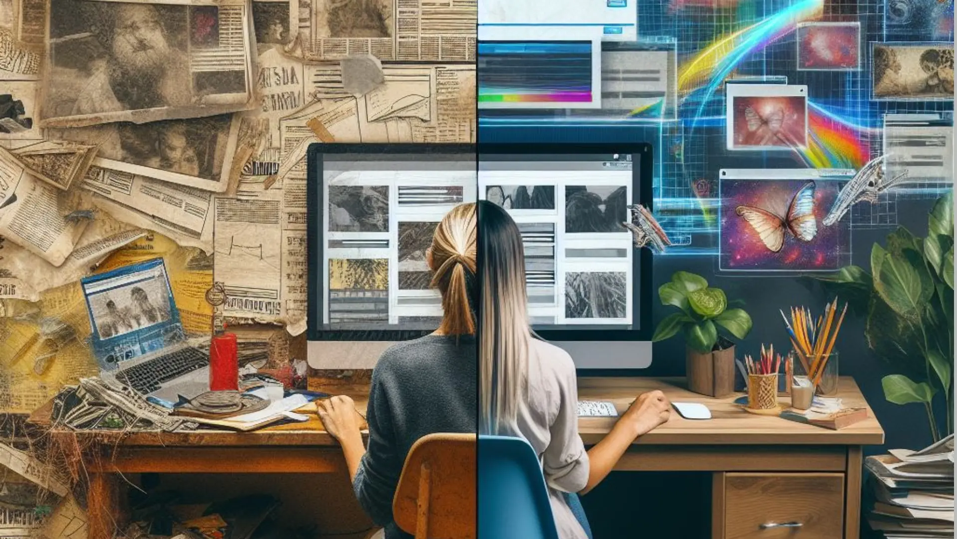
The design of websites has evolved dramatically since the birth of the World Wide Web in the 1990s. As internet technology has advanced and design trends have shifted, web design has adapted to better serve user needs and preferences.
This article will provide an overview of the major web design trends through history, from the basic websites of the 1990s dot-com boom to the sleek, minimalist designs prevalent today. We'll explore how changes in technology, user behavior, and aesthetic taste have influenced web design over the past three decades.
Tracing this evolution reveals deeper insights into our relationship with technology and the priorities of different eras of internet use. While early sites focused on functionality, current trends emphasize usability, responsive design, and conversational user interfaces. This reflects how integral the internet has become in our daily lives.
By charting the trajectory of web design trends, we can gain perspective on where we've been and where we might be headed next in our endless quest to build a better, more intuitive online experience.
Early Days of the Web (1990s)
In the early days of the web, most sites consisted of plain text with few images. Table-based layouts were commonly used to structure pages, with tables used to position page elements in a grid. Background colors, text colors, fonts, and font sizes were limited.
Animated GIFs gained popularity as a simple way to add movement and interactivity. Pages with tiled background GIFs were common. GIFs were also used for simple animations, graphics, and rudimentary navigation buttons.
While design capabilities were limited, early sites focused on delivering content and information to users in a functional way. Pages loaded quickly despite slow dial-up connections. Web design focused on readability and accessibility rather than aesthetics.
The Dot-Com Boom (Late 1990s)
The late 1990s saw an explosion of startups and investment in internet companies, known as the dot-com boom. This period was defined by companies racing to establish an online presence and e-commerce sites.
Web design trends shifted to focus more on graphics, multimedia, and complex branding. Sites featured more images, video, and audio clips. Homepages often had elaborate Flash animations and intros.
Flash emerged as a popular tool for building interactive websites with motion graphics. Designers used Flash for animated logos, navigation, games, and other dynamic elements that weren't possible with just HTML.
Pop-up windows and splash pages were also common tricks to grab user attention. Homepages frequently had pop-up windows with notifications or prompts to subscribe to a newsletter. Splash pages were entry pages with a logo animation that preceded the homepage.
While multimedia made sites more engaging, the heavy use of Flash and pop-ups also often bogged down load times and disrupted user experience. Still, these trends reflected the experimental and competitive spirit of web design during the dot-com boom.
Post Dot-Com Burst (Early 2000s)
The dot-com bubble bursting in the early 2000s led to a return to simpler web designs. With many dot-com companies going under, expensive, flash-heavy websites were no longer en vogue. Web designers shifted to simpler layouts, cleaner interfaces, and a focus on usability.
This period also saw the rise of CSS, allowing designers to have more control over site presentation without resorting to messy HTML tables for layout. CSS box models made it easier to design efficient, flexible layouts. The separation of content from presentation was a huge leap forward.
Some notable design trends in the early 2000s included:
- Single-column layouts with minimalist navigation
- More white space and fewer distracting elements
- Sans-serif fonts and muted color palettes
- Illustrations and textures over photography
- Growing use of CSS for flexible, standards-based layouts
The post dot-com era marked a real maturing of the web, with designers embracing restraint and learning to work within the web's constraints. Usability and accessibility became priorities, leading to simpler, cleaner designs. The rise of blogs also popularized stripped-back, text-focused interfaces. Overall, this period saw the web come into its own aesthetically after the dot-com exuberance.
Web 2.0 and Responsive Design (Mid 2000s)
In the mid-2000s, the web took a huge leap forward in interactivity and responsiveness thanks to AJAX and advancements in JavaScript. Unlike the static, text-heavy pages of the early web, Web 2.0 introduced a more dynamic, interactive, and user-focused experience.
AJAX (Asynchronous JavaScript and XML) allowed content to load and update seamlessly without full page refreshes. This opened the door for features like autocomplete search suggestions, infinite scrolling feeds, drag and drop interfaces, and faster load times. JavaScript frameworks like jQuery also made DOM manipulation and animations much easier.
Around this same time, mobile phone usage was rising exponentially. However, most sites were not optimized for small screens. Responsive web design emerged as an approach to building flexible sites that could adapt and reformat for any device. Media queries, fluid layouts, and responsive images allowed web pages to detect screen sizes and orientations. As a result, web surfing on phones and tablets became far more usable.
The interactivity of Web 2.0 combined with responsive design for mobile marked a major shift in how the web was experienced. Users could now enjoy a smoother, more app-like browsing experience across devices. The web became more dynamic, usable, and engaging.
Flat Design (Early 2010s)
In the early 2010s, web design took a dramatic turn towards flat, minimalist aesthetics. This represented a major departure from the skeuomorphic and glossy styles that preceded it.
Flat design is characterized by:
- A focus on flat graphics, bold colors, and minimal ornamentation
- Simple, open layouts and ample white space
- Large hero images and full-width headers
- Flat, ghost buttons and clean typography
- Strong visual hierarchies and clear navigational patterns
Some of the influential sites leading this charge included Windows 8, Apple's iOS 7 redesign, and Microsoft's Metro UI language. This stripped-down, Swiss-inspired aesthetic was a reaction against the overdesigned skeuomorphism and glossy textures that defined the 2000s.
Flat design achieved popularity for its cleanliness and focus on content over superfluous design elements. It enabled designers to let the content shine while improving page performance. The style also provided a more seamless experience across different devices, thanks to its minimal, responsive layouts.
While flat design was initially controversial, it became widely adopted and influenced design for the rest of the decade. It cleared away many outdated visual tropes and refreshed the web with a simplified, yet striking new aesthetic direction. This established flat design as one of the definitive trends of the 2010s.
Conversational UI (Mid 2010s)
As social media and messaging apps became increasingly ubiquitous in the mid-2010s, designers began exploring more natural interfaces that mimicked real-world conversations.
-
Conversational UI emphasized more casual, informal language along with the use of messaging-style interactions. Apps and websites started to adopt messaging as their primary UI, using friendly language and animated conversational elements like chat bubbles and bot avatars.
-
The rising popularity of voice assistants like Siri, Alexa and Google Assistant also drove growth in conversational interfaces. Brands raced to create voice apps with natural language understanding that allowed users to interact conversationally with voice assistants.
-
On the visual side, conversational UI brought playful, expressive design. Animations like bouncing chat bubbles and animated avatars helped make interactions feel more lively and engaging. Illustrations and mascots were used to give apps a friendly, approachable personality.
Overall, the conversational UI trend reflected a desire to humanize digital experiences and make interacting with technology feel more natural and intuitive through conversation.
Brutalism and Grunge Design (Late 2010s)
The late 2010s saw the emergence of web design trends that embraced raw, edgy aesthetics. Brutalism and grunge design both incorporated bold typography, bright colors, and intentionally imperfect or "glitchy" elements.
Brutalist websites shunned conventions of clean lines and symmetry. Instead they featured raw concrete or brick textures, harsh color schemes, and strong typography. Brutalist design was unapologetically bold and confrontational. Websites discarded polished presentation in favor of raw emotive power.
Similarly, grunge design embraced a gritty, dark, and even sinister aesthetic. The vibe was more underground music venue than corporate site. Grunge design featured muted color palettes and deliberately distorted elements like pixelated or blurred imagery and jagged fonts. Photos were often black and white or desaturated. These websites rejected mainstream appeal in favor of evoking underground subculture.
Both brutalism and grunge tapped into a sense of rawness and imperfection. After years of increasingly sleek and minimalist design trends, these edgier aesthetics felt fresh, rebellious and unrefined. They sacrificed clarity and ease of use for provocative emotional impact.
Neumorphism (2020s)
The 2020s have seen a rise in the neumorphism trend, characterized by soft, dimensional UI with subtle shadows that evoke a sense of physical form and lighting. Neumorphism is the opposite of skeuomorphism, which imitates real-life objects. Instead, neumorphism creates a smooth, organic look with subtle light and shadow to make buttons and other elements appear slightly recessed or raised.
Neumorphism relies on gentle gradients, shadows, and highlights to add depth and shape rather than harsh borders or fake textures. An inner glow suggests a light source across the interface, giving a soothing, ambient feel. Rounded shapes and corners further enhance the natural, smooth aesthetic.
Colors tend to be muted, with plenty of whites and pastels accented by gray shadows. The calming palette and dimensional illusions create an understated yet visually interesting design style. After several years of ultra-flat and minimal interfaces, neumorphism brings in more dimensionality while retaining a clean, modern sensibility.
Conclusion
The evolution of web design trends provides a fascinating look at how aesthetic preferences and capabilities have changed over the relatively brief history of the internet.
In the early days of the web, rudimentary HTML and bandwidth constraints led to simple designs focused on readability and usability. As technology advanced, bandwidth expanded, and standards emerged, designers had more creative freedom leading to the flashy, visually-driven sites of the dot-com era. After this bubble burst, minimalism and clean layouts became the emphasis.
With Web 2.0 came increased interactivity and user participation, necessitating responsive designs adaptable across devices. Flat, minimalist aesthetics dominated for years until designers sought to bring some personality back with bold typography and unusual layouts. Most recently, app-inspired and 3D designs have created more immersive experiences.
Throughout these decades of innovation, some key trends and patterns emerge. Designs have progressively become more visually appealing, interactive, personalized, and optimized for the mobile experience. Technological capabilities unleash new creative possibilities. Design waxes and wanes between minimalism and richness.
Looking ahead, some possibilities for the future include more voice and AI-driven interfaces, virtual and augmented reality designs, and perhaps a return to brutalism or other unconventional aesthetics. As the internet continues to evolve, web design will keep reinventing itself in exciting new ways. But it all builds from these early pioneering trends that shaped the visual language of the web we know today.

Senior Developer