Keyboard Navigation: Making Your Website Accessible to All
Why Keyboard Navigation Matters
Keyboard navigation enables users who cannot use a mouse to access your website. This includes people with motor impairments who cannot control a mouse precisely, blind users who navigate with screen readers, users with temporary injuries, and power users who prefer keyboard efficiency.
WCAG accessibility guidelines require that all functionality be available via keyboard. This isn't optional—it's a fundamental accessibility requirement affecting a significant user population.
Beyond compliance, keyboard navigation often reflects overall code quality. Sites that work well with keyboards typically have cleaner, more semantic code that benefits all users and search engines.
Understanding Keyboard Navigation
Core Keyboard Controls
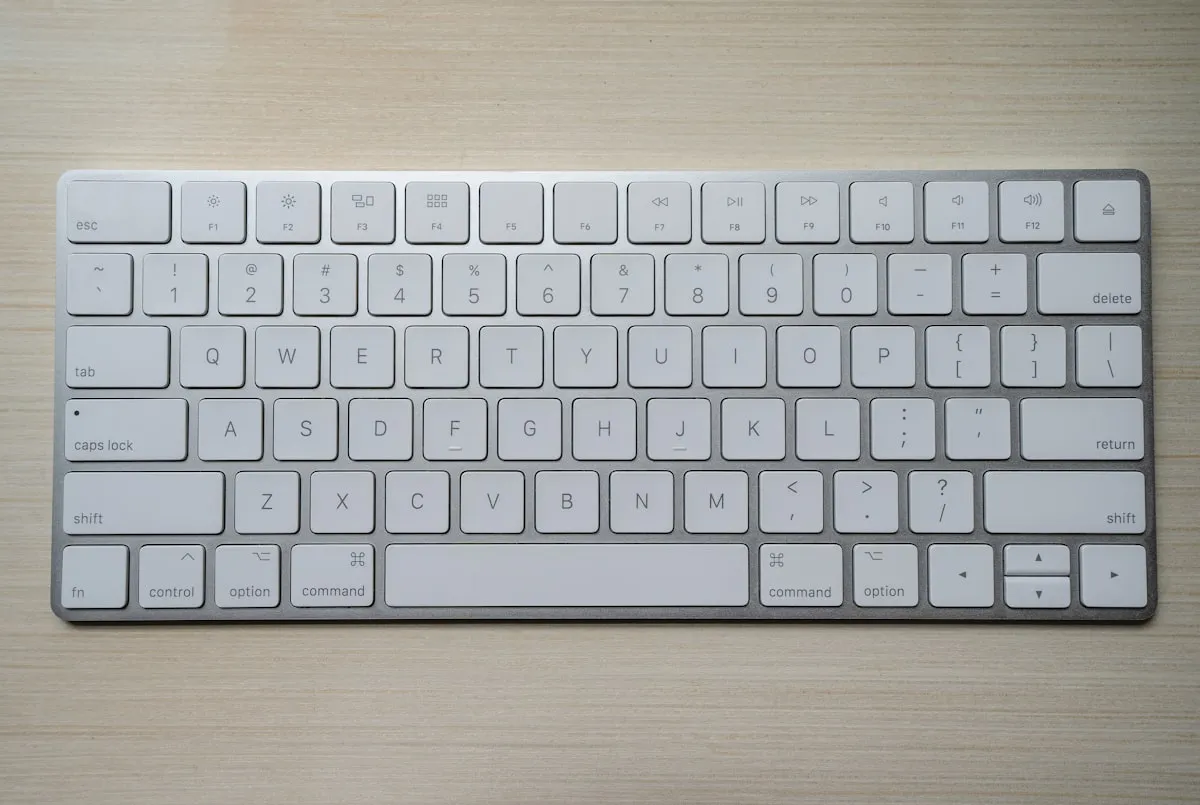
Users navigate websites with specific keyboard keys. Tab moves focus forward through interactive elements. Shift+Tab moves focus backward. Enter activates links and buttons. Space activates buttons and checkboxes. Arrow keys navigate within components like menus and tabs. Escape closes dialogs and cancels operations.
These are the tools keyboard users have. Your website must work with these controls.
Focus Order
As users tab through a page, focus moves through interactive elements in focus order. This order should match the visual reading order—left to right, top to bottom for English language sites.
Illogical focus order disorients users. If focus jumps unpredictably around the page, keyboard navigation becomes confusing and frustrating.
Focus Visibility
Users must see which element currently has focus. Focus indicators—typically outlines around focused elements—show where keyboard actions will apply.
Never remove focus indicators without providing visible alternatives. The CSS outline: none without replacement makes keyboard navigation impossible.
Testing Keyboard Navigation
Basic Testing Process
Testing keyboard navigation requires only a keyboard—no special tools needed. Start at the beginning of your page and tab through every interactive element. Can you reach everything? Does focus order make sense? Can you see focus at all times? Can you activate all functionality?
Document where navigation fails. These are the issues needing attention.
What to Look For
Unreachable elements: Can you tab to every link, button, and form field? Any element users should interact with must be keyboard accessible.
Keyboard traps: Can you always move forward and backward? If focus gets stuck somewhere with no escape, that's a keyboard trap.
Focus visibility: Can you see where focus is at all times? Invisible focus makes navigation impossible.
Logical order: Does focus flow sensibly through the page? Jumping around confuses users.
All functionality: Can you complete all actions—submitting forms, opening menus, playing videos—using keyboard alone?
Common Keyboard Issues
Missing Focus Indicators
The most common issue is removed or invisible focus indicators. Designers sometimes remove default browser outlines for aesthetics without providing alternatives.
Solution: Keep default focus indicators or replace them with equally visible custom styles. Focus indicators should have sufficient contrast and be clearly visible.
Custom Components Without Keyboard Support
Custom components built with div and span elements rather than native HTML may lack keyboard accessibility. Dropdowns, tabs, accordions, and modals often fail keyboard testing.
Solution: Use native HTML elements where possible (buttons for buttons, links for links). When building custom components, implement proper keyboard handlers and ARIA patterns.
Dropdown Menus
Navigation dropdowns frequently fail keyboard accessibility. Submenus that appear on mouse hover often don't open on keyboard focus.
Solution: Allow dropdowns to open on Enter or Space when parent is focused. Use arrow keys for navigation within dropdowns. Ensure Escape closes menus and returns focus appropriately.
Modal Dialogs
Modals often trap focus incorrectly—either allowing focus to escape behind the modal or not moving focus into the modal at all.
Solution: When modals open, move focus to the modal. Trap focus within the modal while open. When closed, return focus to the triggering element. Escape should close the modal.
Interactive Elements in Wrong Order
CSS can position elements differently than their source order. If visual layout doesn't match DOM order, focus order will be confusing.
Solution: Ensure source order matches visual order. Use CSS Flexbox order property sparingly. Test focus order matches expected reading order.
Click-Only Interactions
Event handlers attached only to click events may not fire on keyboard. If JavaScript requires mouse clicks, keyboard users are excluded.
Solution: Attach handlers to appropriate keyboard events as well, or use elements that naturally handle both (native buttons trigger click on Enter).
Building Keyboard-Accessible Components
Use Semantic HTML
Native HTML elements provide keyboard accessibility automatically. Button elements can be focused and activated with Enter and Space. Link elements can be focused and activated with Enter. Form inputs are focusable and editable. Checkboxes and radios respond to Space.
Use these elements for their intended purposes rather than styling div elements to look like buttons.
Focus Management
For dynamic interfaces, manage focus deliberately. When content changes, move focus appropriately. When new content appears, either focus it or announce it. When content is removed, move focus somewhere sensible.
Never leave focus on removed content—users will be stranded.
Skip Links
Skip links let keyboard users bypass repetitive content like navigation. A skip link at the page start allows jumping directly to main content.
Implement skip links that are visible when focused, hidden otherwise. They dramatically improve experience for keyboard users navigating multiple pages.
ARIA for Custom Components
When native HTML isn't sufficient, ARIA (Accessible Rich Internet Applications) provides ways to communicate component roles, states, and properties to assistive technologies.
Learn ARIA patterns for common components: tabs, accordions, dialogs, menus. The WAI-ARIA Authoring Practices provide guidance on proper implementation.
Focus Indicator Design
Visibility Requirements
WCAG 2.2 requires focus indicators to have at least 2 CSS pixels thickness and sufficient contrast against the background. The focus indicator itself should have 3:1 contrast against adjacent colours.
These requirements ensure focus is visible across different contexts and for users with varying vision.
Design Approaches
Common focus indicator approaches include outline rings around focused elements, background colour changes, underlines for links, and border changes.
Whatever approach you use, ensure consistent visibility across your site. Focus should be equally clear on all elements.
Avoiding Problem Patterns
Don't use colour alone for focus—users with colour blindness may not perceive it. Don't use thin or low-contrast indicators that disappear on certain backgrounds. Don't create indicators that interfere with element content.
Test focus indicators across your site's colour palette.
Taking Action
Keyboard accessibility is fundamental to accessible web design. Test your site with keyboard navigation. Fix issues preventing keyboard access. Build keyboard support into development processes.
For professional web development with proper keyboard accessibility, contact Amigo Studios. We help Belfast businesses create websites that work for everyone.

Senior Developer