The Art of Web Typography: Mastering Fonts, Readability, and Brand Identity
Introduction to Web Typography
Web typography refers to the art of designing and arranging type in order to make text legible and appealing on websites. While it may seem like a minor detail, typography is one of the most important elements that affects a website's usability and aesthetics. Choices in fonts, sizes, line heights, and formatting have a significant impact on the user experience.
With the rise of responsive web design, typography has become even more crucial for creating accessible sites. As screen sizes change, fonts need to adapt and reflow seamlessly across devices. Legibility, readability and conveying visual hierarchy must be balanced with brand identity and aesthetics.
In this article, we'll dive into the nuances of web typography. First, we'll look at how typographic choices can reinforce branding. Then we'll discuss principles for selecting readable body text and striking headers. Other topics include font pairing, choosing web-safe fonts, using color effectively, optimizing typography for scanning, and strategies for responsive and adaptive typography. With the right typographic choices, you can elevate your website's personality and create an experience that engages users across all devices.
Typography and Branding
A brand's visual identity starts with its typography. The fonts used throughout a website or app create an immediate association in users' minds and signal what the brand stands for.
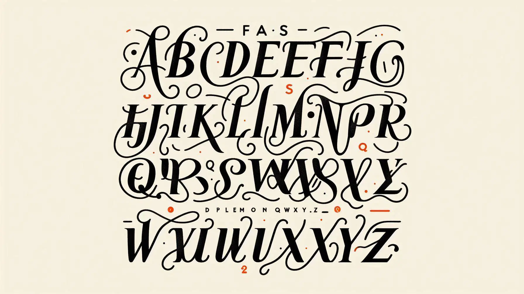
Font selection is a powerful way to reinforce a brand's personality. For example, sans serif fonts like Helvetica convey modernity and minimalism. Serif fonts like Garamond imply tradition and classic style. Display fonts like Impact or Neue Haas Grotesk have a bold attitude. Lightweights fonts exude refinement and delicacy.
When pairing fonts for a cohesive brand identity, avoid too much variation in style. Pairing a lively display font with a serious serif font risks diluting the brand image. Stick to font families that complement one another. Mixing weights and styles within the same font helps maintain consistency.
Keep brand fonts consistent across web, print, packaging and other brand touchpoints. Resist the temptation to use a wider variety of fonts just because digital media makes it easy. Sticking to one or two brand fonts strengthens the visual identity.
Thoughtful typography selections based on brand values are the foundation of a strong, recognizable visual identity. The nuances of font style, weight, spacing and size all influence how people perceive and interact with a brand.
Font Legibility for Body Text
The body text of a website conveys the core information and content to site visitors. Ensuring it is highly readable and legible is crucial for an optimal user experience.
Several factors impact the legibility of body copy:
- Font size - The size of body text should be large enough to read comfortably without straining. For most websites, font sizes between 14px and 16px tend to offer the best balance of legibility and density. Very small fonts under 12px can cause eye fatigue.
- Line height - Having appropriate spacing between each line of text improves scanability and reduces crowdedness. Line heights between 1.4 and 1.6 times the font size are recommended. For 16px text, a line height of 24px provides ample breathing room.
- Line length - Keeping line length constrained to 50-60 characters per line can enhance readability and prevent long unbroken texts from becoming visually overwhelming.
- Font style - Sans serif fonts tend to have cleaner lines which improves legibility at smaller sizes. Serif fonts can work for body copy but may need slightly larger sizes.
- Color contrast - Ensuring sufficient contrast between text color and background color reduces eye strain. Dark text on a light background provides optimal contrast.
With the right font size, line height, and visual style, body copy can feel inviting to read while effectively conveying information on the page. Legible body text helps improve user experience and SEO.
Headline and Display Text
Headlines and display text require different typographic considerations than body copy. Their purpose is to grab attention, convey visual hierarchy and dramatic impact. Some key principles:
- Use larger font sizes for headlines and key call-out text. Headline fonts are typically at least twice the size of body copy. Subheads can range between the two sizes. Higher contrast in sizing creates an obvious visual hierarchy.
- Employ bold, italic or all-caps for punchy impact. Making headlines bold or italic adds distinction from plain body text. All-caps lends a dramatic, eye-catching effect. But use them sparingly, as large blocks of all-caps or italic are hard to read.
- Add letterspacing for elegance. A bit of tracking (letterspacing) on headlines can impart a refined, stylish vibe. Just don't overdo it.
- Maintain strong contrast with body copy. Headlines pull focus because they look so different from body text. Keep body copy muted, monochromatic and textured so display text pops in contrast.
- Align headlines to body text. Left-aligning headlines is most readable. Right-aligned or centered headlines can work for impact, but read slower.
- Watch line lengths. Headlines with too many characters per line are hard to read. Break them manually or reduce font size until reading flow improves.
With smart typographic choices, your headlines and display text will capture attention and visually anchor the content hierarchy.
Font Pairing Principles
Choosing complementary font pairings is key for creating stylistic harmony in your web design. When pairing fonts, aim for sufficient contrast between the fonts while maintaining cohesion.
Complementary vs. Contrasting Fonts
Complementary fonts have stylistic similarities that connect them, while still providing enough contrast for differentiation. For example, pair a simple sans serif font with a more elegant serif font. Overly contrasting fonts can clash, so seek balance.
Serif/Sans-Serif Combinations
A popular font pairing is a serif headline or header with sans serif body content. The serif injects stylistic flair while the clean sans serif improves readability. Other combinations like sans serif headlines with serif body content can also work well.
Limiting Font Families
Limit your web page to 2-3 font families at most. Too many fonts compete visually. Stick to one serif and one sans serif for a simple and legible style. Be selective in which font variations you use sparingly for headings or accents.
Choosing Web-Safe Fonts
When selecting fonts for your website, it's important to choose fonts that will display properly across different operating systems, browsers and devices. Relying solely on default fonts installed on the user's device is the safest option. Here are some guidelines for choosing web-safe fonts:
Default Web-Safe Fonts
The most universally web-safe fonts are the default sans-serif, serif, monospace and cursive fonts built into operating systems and browsers. These include:
- Sans-serif fonts like Arial, Helvetica, and Verdana
- Serif fonts like Times New Roman, Georgia, and Cambria
- Monospace fonts like Courier and Consolas
- Cursive fonts like Comic Sans and Brush Script
While not the most exciting font choices, these fonts will render consistently across platforms.
Serif vs. Sans-Serif
- Serif fonts have decorative "feet" at the ends of strokes. They are generally considered easier to read in print.
- Sans-serif fonts have clean lines without serifs. They are often considered easier to read on screens.
Sans-serif fonts are commonly used for online body text, but serif can work well too. Play around to see what improves readability for your content.
Fixed vs. Proportional Fonts
- Fixed width fonts have letters that all occupy the same amount of horizontal space. This allows content to line up cleanly in blocks, so they are commonly used for code.
- Proportional fonts have letters that take up different amounts of space. The majority of fonts fall into this category.
Proportional fonts create more natural word spacing for body text. But monospace fixed fonts may suit code samples.
Web Font Services
Many services like Google Fonts, Adobe Fonts, and Font Squirrel allow you to embed custom web fonts on a webpage directly from their libraries. This provides more unique font choices while ensuring proper licensing and formats. Just be sure to include fallbacks in case the custom font fails to load.
With a balance of function and creativity, your font choices can enhance branding while ensuring readability. Focus on web-safe fonts first, then complement with tested web fonts as needed.
Utilizing Color in Typography
The use of color in typography can enhance readability and visual appeal when done thoughtfully. However, color should be applied judiciously, as improper use can hamper legibility.
Black vs. Colored Text
Black text on a white background is the most legible color combination for body copy. But for headlines and accents, colored text can attract attention and create visual interest. Vibrant shades like reds, blues and greens work well in headlines. Avoid extremely light colors like yellow and cyan for body text. Theystrain the eyes.
Background Color Interactions
Watch text and background color combinations carefully. Insufficient contrast causes words to visually bleed together. Light text over dark backgrounds and dark text over light backgrounds optimize contrast. Be mindful of colored backgrounds, ensuring the overlaying text provides enough contrast.
Accessibility Considerations
When applying color in typography, ensure enough contrast for visually impaired users. The WCAG minimum contrast ratio for normal text is 4.5:1. For large text, it's 3:1. Background colors shouldn't convey meaning alone. Provide supporting text descriptions for color-coded data. Allow users to customize text colors for accessibility.
Typography for Scanning
With the rise of digital content, readers increasingly scan webpages rather than read word for word. Typography can make content more scannable and accessible.
Breaking up text for scanning
Chunking text into short paragraphs and using whitespace between blocks of text allows readers to quickly scan and jump to parts that interest them. Avoid dense walls of text.
Highlighting key terms
Bold or italic styling draws attention to important keywords and phrases, guiding the reader's eyes. But don't over-highlight, or the text becomes noisy.
Bullet points and numbering
Lists help break up text and make information easy to absorb at a glance. Use bullet points for non-sequential items and numbered lists for step-by-step instructions.
With thoughtful typography that aids visual flow, you can optimize content for online scanning and create a smooth reading experience even for busy readers.
Responsive Web Typography
As more users access the web on mobile devices and tablets, responsive web design has become essential. Typography plays a key role in creating a seamless experience across viewports. Using relative sizing units like em or rem instead of pixels allows text to resize smoothly on different screens.
Setting breakpoints with CSS media queries enables adaptive typography based on screen size. You may enlarge fonts and increase line height on smaller viewports for improved readability, while decreasing font sizes on larger screens to avoid excessive white space.
Fluid layouts with flexible containers intrinsically adapt to various viewports. However, you can fine-tune typography further with media queries. In fixed layouts, media queries are critical for resizing and reflowing text effectively on mobile.
Aim for an optimal balance of reading comfort, aesthetic appeal, and brand consistency across device sizes. Mobile-first responsive design ensures your typography works beautifully on small screens, while media queries refine the presentation on progressively larger viewports. Regardless of screen size, typography should reinforce your brand identity and enable easy reading without clutter or squinting.
Conclusion
Web typography is an integral, yet often overlooked, aspect of web design. In this article we explored the key considerations around selecting fonts for the web and utilizing typography effectively.
A few of the main takeaways:
- Typography has a significant impact on brand identity. Font selection should align with your brand's personality and tone.
- Body text readability depends heavily on font, size, line height, and spacing. Prioritize legibility for long passages of text.
- Headlines and display text can be more creative, but still require attention to readability based on font style and weight.
- Pairing fonts follows principles like contrast and consistency. Complementary fonts create visual harmony.
- Web-safe fonts have widespread browser support. But many new font options are emerging through services like Google Fonts.
- Color can draw attention to typography and communicate meaning. But use it thoughtfully and sparingly.
- Responsive design requires adjusting typography based on screen size and device. Media queries and relative units like EM are key.
Mastering web typography takes practice, but has immense payoff in conveying information effectively. The resources below offer guides for further learning:
- Practical Typography by Matthew Butterick
- Web Typography: Designing Beautiful Web Typography by Ben Frain
- Web Typography Start to Finish by Richard Rutter
With care and creativity, your web typography can elevate the user experience and amplify your brand voice.

Senior Developer