Responsive Web Design: Crafting Great Experiences Across Devices
Introduction to Responsive Design
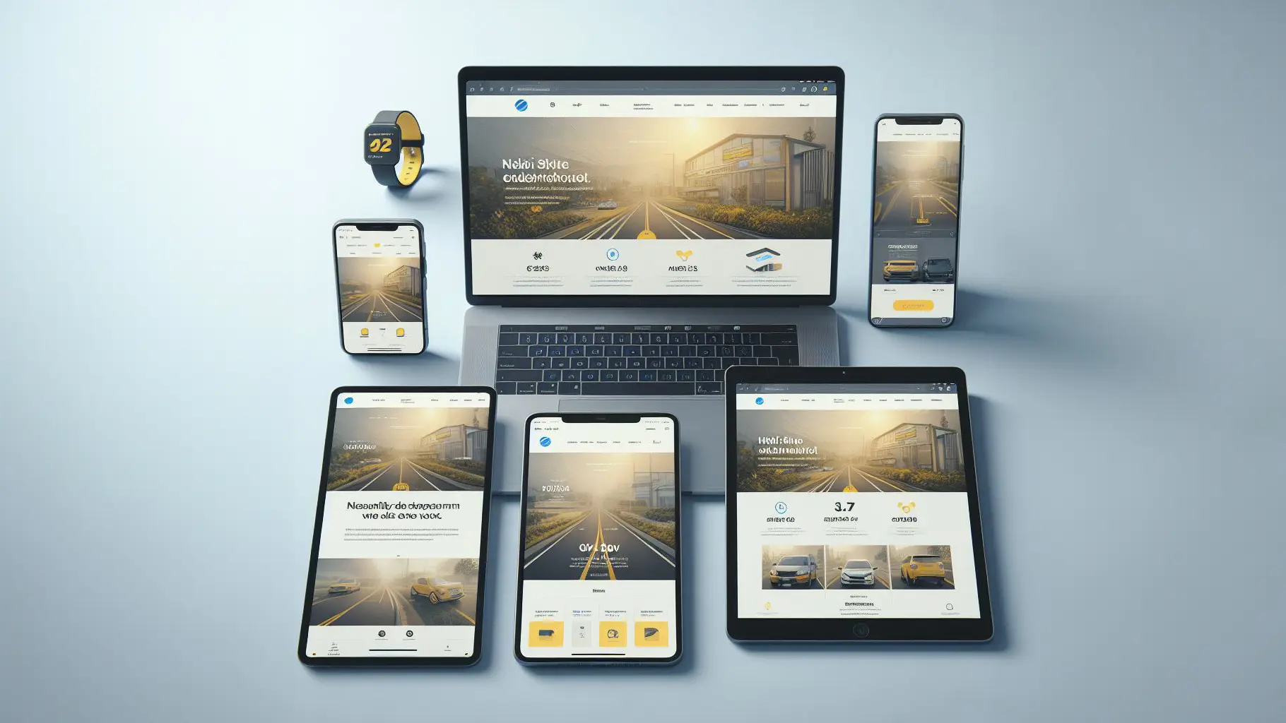
Responsive web design refers to the strategy of building websites that adapt their layout and elements to provide an optimal viewing and interaction experience across different devices and screen sizes.
With the explosive growth of internet-connected mobile devices like smartphones and tablets, responsive design has become essential for delivering a high-quality user experience. Studies show that over 60% of web traffic now comes from mobile devices. Having a responsive website is crucial to providing a seamless browsing experience for users and avoiding issues like tiny text, inconvenient navigation, or distorted images on smaller screens.
The goal of responsive design is to build websites that automatically adjust their layout to maximize visibility and ease-of-use regardless of the device. Using fluid layouts, flexible images and CSS media queries, responsive sites can optimize their content and navigation for anything from a widescreen monitor to a smartphone screen. The end result is happier users who can comfortably view and interact with sites on any device.
In this article we'll dive into the history, techniques and best practices of responsive web design. Understanding responsive design is key for anyone creating modern websites and looking to reach the widest range of users in today's multi-device world.
History of Responsive Design
Responsive web design was first proposed by web designer Ethan Marcotte in 2010. At the time, more and more people were accessing the web on mobile devices like smartphones and tablets in addition to desktop computers. However, most websites were designed only for desktop screens, leading to a poor user experience on smaller mobile screens.
Marcotte proposed an approach called responsive web design that uses CSS media queries and fluid layouts to dynamically adapt a website's layout and content to match the user's device screen size. Instead of creating a separate mobile website, responsive design allows for one flexible code base that renders optimally across all devices.
Some key developments that enabled responsive design include:
- Media queries - Added to CSS3 in 2007, they allow applying CSS styling based on parameters like screen width. This enables detecting the user's device and adjusting layout accordingly.
- Flexible grid systems - Frameworks like Bootstrap provide responsive grid systems for building flexible page layouts using CSS. Columns stack vertically on small screens and horizontally on larger screens.
- Flexible images - Making images responsive using max-width: 100% enables them to scale down for smaller screens without overflowing.
- Viewport meta tag - The viewport meta tag controls the browser's viewport width and scaling on mobile devices. This enables proper rendering of responsive pages on mobile.
As mobile device usage grew exponentially in the early 2010s, responsive design was widely adopted as an essential for modern web development. Frameworks and techniques evolved to meet the multi-device landscape and responsive design became standard best practice for web design.
How Responsive Design Works
Responsive design works through a combination of flexible layouts, media queries, and responsive images and media. Here's an overview of the key features:
Media Queries
Media queries allow designers and developers to specify different CSS styling rules based on characteristics of the device or viewport. For example, larger desktop layouts versus narrower mobile screens. By using media queries, different CSS can be applied as screen sizes change.
Some common examples include:
- `@media (min-width: 600px)` - Applies CSS for viewports above 600px wide.
- `@media (max-width: 480px)` - Applies CSS for viewports under 480px wide.
By writing CSS that responds and adapts based on media queries, the layout can flexibly change across screen sizes.
Fluid Layouts
Responsive designs use fluid, flexible layouts that expand and contract dynamically based on the viewport. This means using relative width units like percentages or viewport units rather than fixed pixels.
Elements within a fluid layout resize and reflow as needed to best utilize the available space on any device. This creates a flexible foundation to build responsive features on top of.
Flexible Images and Media
For images, videos, and other media, responsive design employs techniques to serve the most appropriate file format, size, and resolution based on screen characteristics.
This includes setting the images' max-width to 100% to flexibly resize, and providing differently-sized image files to serve smaller, optimized files to mobile devices. Newer techniques like responsive images and variable image formats also help deliver the right images for the right device.
Breakpoints
Responsive design utilizes breakpoints to target common device widths like tablets, small screens, large screens, etc. Media queries are configured around these breakpoints to apply the appropriate layouts and behavior for each screen category. This allows for optimized experiences across common device sizes.
Benefits of Responsive Design
Responsive design offers several key benefits that make it an appealing option for designing websites and web applications today:
One Website for All Devices
With responsive design, only one website needs to be designed and developed. The same HTML, CSS and JavaScript works seamlessly for mobile phones, tablets, laptops and desktops. You don't need to maintain separate mobile and desktop versions of the site. This simplifies development and ongoing maintenance.
Optimized User Experience
Responsive design creates an optimal viewing and interaction experience across diverse devices. On mobile phones, the page can be organized in a single column layout that is easy to read. On larger screens like laptops and desktops, multi-column layouts can better utilize the extra screen real estate. Responsive CSS takes care of optimizing the user interface and journey automatically.
Easier Maintenance than Separate Mobile Site
With a separate mobile website, any updates need to be implemented twice - on mobile and desktop. With responsive sites, updates only need to be made once. This reduces the effort required for ongoing maintenance and minimizes the chances of mobile and desktop versions getting out of sync.
By leveraging responsive design, websites can reach and engage users on any device while streamlining development and maintenance needs. This adaptive approach is critical for today's digital landscape of varied screen sizes and contexts of use. Responsive principles allow creating future-proof experiences that can gracefully handle new devices and screen resolutions.
Responsive Design Best Practices
Implementing responsive design well requires following certain best practices:
Mobile-first
The mobile-first approach means designing for mobile screens first before moving onto larger breakpoints. This ensures the mobile experience remains streamlined, focusing on the most important elements and progressively enhancing the layout for larger screens. By optimizing for mobile first, responsive sites load faster and work better across all devices.
Flexible layout
Using a flexible grid, flexible images, and media queries allows the layout to smoothly adapt across viewports. Setting dimensions with relative units like percentages or ems instead of fixed pixels enables fluid adjustments. Media queries apply different CSS styling based on screen width breakpoints.
Minimal page weight
By streamlining code, compressing images, and removing unnecessary bloat, pages can load faster. Stripping down to the essentials improves performance, especially on mobile. Loading fewer external assets also reduces reliance on network connections.
Test on all viewports
Responsive design must be thoroughly tested across a range of devices and viewports. Emulators provide a starting point but real mobile testing is essential. Testing responsive breakpoints and interactions ensures flexibly across screen sizes without loss of functionality.
Implementing Responsive Design
There are several common techniques and tools that make implementing responsive design easier:
Grid-Based Layouts
Using a grid-based layout is a powerful way to build responsive web pages. Grid systems provide structure for page content by using columns that dynamically adjust and stretch to fit different screen sizes. Popular CSS grid systems include Bootstrap, Foundation, and Flexbox.
Grid columns are sized using relative units like percentages or viewport widths to flexibly adapt as the viewport changes. Media queries can alter the number of columns used on larger vs smaller screens. For example, stacking columns vertically on mobile. Grid frameworks handle many complexities behind the scenes.
CSS Frameworks
CSS frameworks like Bootstrap, Foundation, Materialize provide pre-built components and grid systems to accelerate responsive development. They include:
- Responsive navigation menus that collapse on mobile
- Image, text, button, form, and card components that automatically resize
- Grid system classes for quickly creating page layouts
- Utility CSS classes for typography, spacing, color, etc.
This allows developers to build responsive interfaces faster, using the framework utilities and components instead of hand-coding every part.
Component-Based Design
A component-based approach structures the UI into independent, reusable pieces that can adapt and move fluidly across screen sizes. For example:
- Headers
- Navigation
- Sidebars
- Main content sections
- Footers
Each component uses percentages, em units, or responsive CSS to flexibly size itself no matter the screen width. This strategy makes responsive design much more maintainable long-term.
Responsive Design Testing
Testing is a critical part of implementing responsive design. With so many device sizes, screen resolutions, and browsers to account for, thorough testing helps ensure a smooth responsive experience.
Emulated Devices
Using emulated devices is a key testing method. Developer tools in browsers allow you to emulate various phones and tablets to see how your site looks and functions. This helps you identify styling and layout issues. For example, you can catch things like overflowing containers, squished images, and broken grids.
Emulated devices are great for quick testing during development. But always test on real devices before launch as emulator testing alone isn't sufficient.
Simulated Networks
Simulating different network connections is also important. Test your site on slow 3G, spotty connections, as well as WiFi. This allows you to optimize performance for environments with limited bandwidth. You want to make sure page load times are fast even in poor network conditions.
Cross-Browser Testing
Test across all major browsers like Chrome, Firefox, Safari, Edge, and Internet Explorer. Responsive issues often surface in some browsers and not others. Cross-browser testing helps you normalize the experience. Use a tool like BrowserStack for automated cross-browser testing.
Automated Testing
Automated testing saves time and reduces human error. Use responsive testing tools to crawl your site and identify issues. These tools can test responsiveness, performance, accessibility, SEO, and more. Popular options include Selenium, Cypress, Responsive Design Checker, and Lighthouse. Automated testing surfaces problems early so you can fix them faster.
Responsive Design Limitations
While responsive design offers many benefits, it also comes with some limitations to be aware of:
Performance Considerations
- Increased complexity of responsive sites can impact performance. More media queries, more CSS and JavaScript leads to larger file sizes and slower load times. This is especially true on mobile devices with limited bandwidth.
- Responsive images require serving multiple versions of images to cater to different screen sizes. This again increases page weight. Techniques like lazy loading can help mitigate the impact.
- More DOM elements and increased functionality leads to longer script execution times. Code optimization and testing on lower-powered devices is key.
Complex UIs
- Designing distinct optimized experiences across different breakpoints gets exponentially harder as more device sizes emerge.
- Too many variations in layout and functionality across viewports creates complexity and inconsistencies in UX. Striking the right balance is an art.
- Certain complex UI patterns like mega-menus, complex data tables, modals and overlays can be difficult to adapt elegantly.
Legacy Browser Support
- Full responsive design capabilities rely on CSS3 media queries and other modern web standards absent in legacy browsers.
- Supporting dated IE versions requires additional polyfills, code forks, fallback functionality, and testing overhead.
- Reliance on graceful degradation instead of enhancement for legacy browsers leads to compromised experiences.
While not insurmountable, these limitations warrant forethought and testing to overcome. But the benefits of crafting agile, future-friendly designs far outweigh the effort.
The Future of Responsive Design
As responsive design matures, several promising areas are emerging for further optimization and enhancement:
New layout methods
- New CSS layout methods like Flexbox and Grid aim to improve page layouts across screen sizes. These provide more powerful, flexible options beyond floats and tables.
- Layout methods like element queries and container queries look beyond screen size to respond to the actual size of elements on the page. This allows more contextual responding to the user's viewport.
Component-based architecture
- A component-based approach structures sites into reusable, modular components that can be more easily adapted across viewports.
- Components and templates allow more consistency across screen sizes. Design systems also aid consistency.
- This modular approach pairs well with popular JavaScript frameworks and libraries.
Performance optimizations
- Optimizing images, web fonts, JavaScript/CSS delivery, and other assets is key for performance across devices.
- New standards like HTTP/2 aim to speed up page loading through enhanced compression and parallelization techniques.
- Performance budgets set targets for page loading speed to ensure fast experiences.
Conclusion
Responsive design has had a significant impact on how we build websites and applications in the modern multi-device world. As we've explored, responsive design dynamically adapts sites and apps to provide an optimal viewing and user experience across different devices and screen sizes.
Some key points:
- Responsive design was created to address the proliferation of mobile devices and their varying screen sizes. It revolutionized web design by using fluid grids, flexible images and media, and CSS media queries to build responsively.
- The benefits of responsive design are numerous. It leads to greater accessibility, consistency, maintainability, and optimization. Responsive sites only require one codebase and load faster. They provide better user experiences leading to improved engagement and conversions.
- Implementing responsive design requires careful planning and iteration. Follow best practices like mobile-first, progressive enhancement, fluid grids, flexible media, and media queries. Test across all target devices. Track analytics.
- Responsive design does have some limitations like potential performance issues, design limitations, and the need for more testing. However, overall it remains essential for delivering modern multi-device experiences.
As mobile device use and screen sizes continue expanding, responsive design will only grow more important. It enables us to future-proof sites and apps to provide optimal experiences as technology evolves. Responsive design is a necessity for the modern web, delivering significant user experience and accessibility benefits.

Senior Developer